Tuesday, 20 September 2011
Audience Profile
Monday, 19 September 2011
Permission Request
Thursday, 15 September 2011
Initial Ideas
Friday, 9 September 2011
9 Frame Analysis

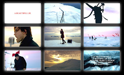
30 Seconds to Mars - A Beautiful Lie
The video opens to a match being lit in slow motion. This relates to the theme of the video and the idea of saving the melting ice caps. The flame is meant to represent us, because we are having a damaging effect on the environment; causing the ice caps to melt much like a flame would. This is when the title screen fades in. It has a very simple design’ a white background with red text in the centre. The colour red could be representative of the band’s anger towards the environmental damage.
Just before the band begins to play there are lots of high angled shots that are quickly cut together, mainly establishing the area. In one of these shots the lead singer is stood on top of a large, icy mountain. This appears to be very visually impressive and is attempting to gain the ‘awe factor’. A lot of the video is in slow motion which amplifies the bands strong posture, portraying them in a serious way which is very fitting to the tone of the song. They are also often shown as silhouettes, which creates a high contrast style that is continued throughout the video, again for the purpose of aesthetics.
The lead singer, as with many videos in this genre, is the focal point and is therefore captured by a lot of narrow and close-up camera angles. This is mainly done because generally the lead singer is the most recognisable member of the band is MEAT shots are more effective. Long shots of individual band members are also frequent as it allows the audience to clearly see their performance, which is a common convention within the genre. This also reveals the band’s costume which portrays them in a stereotypical way; the main colour they are wearing is black as it is commonly associated with the rock genre, but they are also in a snowy climate meaning they would be expected to dress warmly.
A long shot of the fill band together reveals the desolate area that surrounds them, intensifying the atmosphere created through the tone and meaning of the song. These shots tent to be followed up by medium close-ups of each band member. When the music begins to slow down, these medium close-ups are cross cut with a shot of a huge fire in slow motion. This again is to link to the melting ice caps and show that humans are responsible.
As the video comes to a close a montage of scenery shots are cut together. The shots have a lot of movement, mostly zooming and panning from a high angle. This suggests that it was probably filmed using a helicopter. All if these shots are for dramatic effect, in a similar style to that of charity adverts. Once the song is over another title sequence appears, explaining the meaning behind the song and providing statistics as well as showing movie-style credits. This is a very unconventional thing to see in a music video and hasn’t been done a lot but it shows that the band take pride in their work and it portrays them in a very good way for using their status to help the environment.
Thursday, 8 September 2011
Digipak Analysis
The images used are all a very specific cartoon art style which is very dark and creepy. Images such as the town have a very clear link to the album title. This helps to set a theme for rest of the images and begins to almost create a strange narrative.
The band is represented in quite a disturbing way with the references to hell and the image of the hand emerging from the ground. It's evident they were attempting to create a very ominous sensation surrounding the album and I think they have achieved it very successfully. I also think it represents the tone of their lyrics very accurately, although you would probably expect their genre to be heavier. The style also suggests a lot about the institutional context of the music because we can definitely assume that it isn't designed for mainstream audiences.

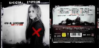
This digipak is for Avril Lavigne's album Under my Skin. The artwork is very stylised to portray Avril in a way which will reflect her star persona. The album is mainly black and white, reflecting the tone of the album which is very depressing. Some areas are also highlighted in red which may relate to anger and pain, again reflecting the tone of the album and concept behind the lyrics. The red cross on her arm may also suggests that she feels targeted. This same red cross is shown on the disk, linking the two together.

Only two images are used on the digipak, both showing the the singer. This suggests the album is a reflection of her emotions and she relates to it. It is also used as a marketing technique as her star image may grab people's attention and sell the album. The same font is used for all of the text, except the small print at the back. The font is very stylised to conform to the dark nature of the album, this is very common in the singer's work. The album title, Under My Skin is written in red. Red is a very emotionally intense colour, amplifying the implications of the title.
Wednesday, 7 September 2011
Saturday, 2 July 2011
Magazine Advert Analysis

The images used in this advert make it appear very busy. It doesn’t seem to stick to a conventional colour scheme, instead using white text with a slightly transparent brown background which overlays the album artwork for 'Hold me down'. This creates a very strong contrast and makes the text stand out. The layout is very basic, and appears to be inspired by a poster style, using bold bursts of colour in the centre to capture the attention of the potential audience and surrounding it with very basic information. Although there appears to be quite a lot of text present, the majority just lists tour dates which is a common convention of larger adverts found in magazines. The fact the band are going on tour give them a higher priority and mean the magazine are more willing to scale up the advert. The name of the band ‘You Me at Six’ is the largest text on the page, ensuring that it is the focal point. The bottom of the page also has a release date which is expected on every advert. The same font is used for all of the text allowing it to appear a lot more structured against the background image. There seems to be very little relationship between the text and images other than the fact the album cover is used. However, this does act as a signifier creating an immediate link to the band. Without knowing who the band was, the audience would most likely be able to determine very basic information about them. For example the bright colours arranged into a busy explosion effect suggest that the music style would be quite up-tempo, possibly leaning towards the Pop genre. The lack of black also suggests the genre will be more ‘positive’ than the hard rock and metal that black is commonly associated with. The size of the advert shows that the band featured is becoming more prevalent in mainstream media. This would suggest that this isn’t the band’s first album and they are already quite established in the industry, especially because of the tour dates. From this advert we could also assume that the target audience is likely to be from around 15-25 and predominantly male. This is because of the very bright and bold colours and abstract imagery.
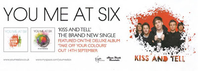
This advert is very different from the one above which could be because this is advertising an earlier album. The advert takes on a much more simplistic layout, only using 2 colours against a white background. This creates a very bold illusion which is understated while still having the same effect. The two colours used are black and orange which not only contrast against the white background but also clash against each other to maximise the bold effect. According to colour theory a dark orange colour can signify deceit or distrust which links to the title of their new single 'Kiss and Tell'. An image of the band is placed to the right which also follows the colour scheme of black and orange. A ‘splatter’ effect is used to fade the image into the background. This relates to the cover of the album which can be seen to the left, in which there is a large splash of colour over a black colour palette. The album is called ‘Take off your colours’ and I am therefore surprised that so few colours were used in this advert.The name of the band is at the top of the advert and again, is the largest text on the page. This causes it to be very prominent and therefore makes the advert very clear. There is very little text on this advert but gives very critical information such as the name of the album and the release date; it also mentions a single which will be available in attempts to draw more people in. Unlike in the other advert, we can see a very clear link between the images used and the text; an image of the band is placed directly next to their name at the very top and both the album and single mentioned both have artwork to accompany their names. I think the lack of colour and imagery detracts from the bands personality and therefore portrays them in a very generic way. This could potentially be problematic when trying to appeal to a new potential audience. The image of the band is used as very basic iconography, linking them directly to the advert. The images of the album artwork would also be expected to do the same job but they couldn’t be initially associated with the band because they haven’t been released yet. This advert seems to be breaking the conventions of adverts from a similar genre as we would typically expect to see a lot more colour. This advert suggests that it is most likely the band’s first album, mainly due to its simplicity. I think this restricts its potential target audience as it would be very easy to overlook.

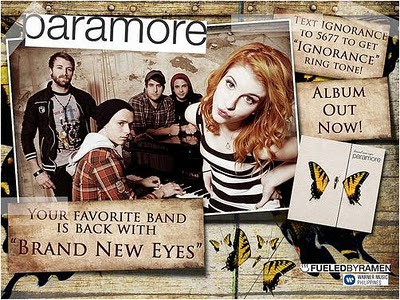
This advert is another, which uses a poster-style layout, appearing very busy to attract attention. The layout is more complex than the other adverts as a lot of the images overlap that are placed on an angle. However, the name of the band is still placed at the very top of the advert. The busy effect created by the overlapping images is balanced out by the use of mostly one colour; brown. A wooden texture is used in the background, creating a simplistic rural feel, which is relevant to the origins of the band. It also appears to be quite worn which relates to the band almost splitting up before releasing the album. The butterfly image also links the advert to the album it is advertising ‘Brand New Eyes’. The name of the album is also written within one of the 3 brown boxes. All of the text is black which contrasts against the brown while still remaining understated. However the band’s name is highlighted with a white background, which creates a very strong contrast and makes the title stand out without it needing to be bold. The ‘title’ text is also in a different font and not punctuated which may link to the bands casual attitude to their music after the recovery from their split. The choice of language in the advert is very conventional, speaking directly to the audience; ‘Your favourite band is back’. Another feature, which isn’t commonly seen in adverts of music from this genre, is the ability to send a text to receive a ringtone. This method is more commonly seen in mainstream music.
The text and images work well together to demonstrate the theme of the album as well as replicate the simplicity of the album cover design. Minimal iconography is used which represents the band, this suggests they want to start fresh and not be stereotyped by their past work. At the bottom right of the advert there is a logo for the album that Paramore are signed to; ‘FuledByRamen’. This could suggest that Paramore are quite a well-established band because the label wants to be associated with them.
From this advert we can determine that the audience is mostly specialist but the band are trying to break into mainstream media (text for a ringtone feature).