
Saturday, 2 July 2011

Magazine Advert Analysis


Magazine adverts often share some common features.
For example; all three of the adverts I will be looking at have the name of the band they are advertising at the very top. This means the advert is easily identifiable and may have an impact even if someone was to only glance at it. The adverts also follow a very specific colour scheme, which is often related to the album featured. This again helps to make the advert more identifiable. A release date for the album is often included and the images and graphics used are very relevant to the band, maintaining a similar style to the album artwork.

The images used in this advert make it appear very busy. It doesn’t seem to stick to a conventional colour scheme, instead using white text with a slightly transparent brown background which overlays the album artwork for 'Hold me down'. This creates a very strong contrast and makes the text stand out. The layout is very basic, and appears to be inspired by a poster style, using bold bursts of colour in the centre to capture the attention of the potential audience and surrounding it with very basic information. Although there appears to be quite a lot of text present, the majority just lists tour dates which is a common convention of larger adverts found in magazines. The fact the band are going on tour give them a higher priority and mean the magazine are more willing to scale up the advert. The name of the band ‘You Me at Six’ is the largest text on the page, ensuring that it is the focal point. The bottom of the page also has a release date which is expected on every advert. The same font is used for all of the text allowing it to appear a lot more structured against the background image. There seems to be very little relationship between the text and images other than the fact the album cover is used. However, this does act as a signifier creating an immediate link to the band. Without knowing who the band was, the audience would most likely be able to determine very basic information about them. For example the bright colours arranged into a busy explosion effect suggest that the music style would be quite up-tempo, possibly leaning towards the Pop genre. The lack of black also suggests the genre will be more ‘positive’ than the hard rock and metal that black is commonly associated with. The size of the advert shows that the band featured is becoming more prevalent in mainstream media. This would suggest that this isn’t the band’s first album and they are already quite established in the industry, especially because of the tour dates. From this advert we could also assume that the target audience is likely to be from around 15-25 and predominantly male. This is because of the very bright and bold colours and abstract imagery.
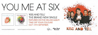
This advert is very different from the one above which could be because this is advertising an earlier album. The advert takes on a much more simplistic layout, only using 2 colours against a white background. This creates a very bold illusion which is understated while still having the same effect. The two colours used are black and orange which not only contrast against the white background but also clash against each other to maximise the bold effect. According to colour theory a dark orange colour can signify deceit or distrust which links to the title of their new single 'Kiss and Tell'. An image of the band is placed to the right which also follows the colour scheme of black and orange. A ‘splatter’ effect is used to fade the image into the background. This relates to the cover of the album which can be seen to the left, in which there is a large splash of colour over a black colour palette. The album is called ‘Take off your colours’ and I am therefore surprised that so few colours were used in this advert.The name of the band is at the top of the advert and again, is the largest text on the page. This causes it to be very prominent and therefore makes the advert very clear. There is very little text on this advert but gives very critical information such as the name of the album and the release date; it also mentions a single which will be available in attempts to draw more people in. Unlike in the other advert, we can see a very clear link between the images used and the text; an image of the band is placed directly next to their name at the very top and both the album and single mentioned both have artwork to accompany their names. I think the lack of colour and imagery detracts from the bands personality and therefore portrays them in a very generic way. This could potentially be problematic when trying to appeal to a new potential audience. The image of the band is used as very basic iconography, linking them directly to the advert. The images of the album artwork would also be expected to do the same job but they couldn’t be initially associated with the band because they haven’t been released yet. This advert seems to be breaking the conventions of adverts from a similar genre as we would typically expect to see a lot more colour. This advert suggests that it is most likely the band’s first album, mainly due to its simplicity. I think this restricts its potential target audience as it would be very easy to overlook.
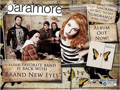
This advert is another, which uses a poster-style layout, appearing very busy to attract attention. The layout is more complex than the other adverts as a lot of the images overlap that are placed on an angle. However, the name of the band is still placed at the very top of the advert. The busy effect created by the overlapping images is balanced out by the use of mostly one colour; brown. A wooden texture is used in the background, creating a simplistic rural feel, which is relevant to the origins of the band. It also appears to be quite worn which relates to the band almost splitting up before releasing the album. The butterfly image also links the advert to the album it is advertising ‘Brand New Eyes’. The name of the album is also written within one of the 3 brown boxes. All of the text is black which contrasts against the brown while still remaining understated. However the band’s name is highlighted with a white background, which creates a very strong contrast and makes the title stand out without it needing to be bold. The ‘title’ text is also in a different font and not punctuated which may link to the bands casual attitude to their music after the recovery from their split. The choice of language in the advert is very conventional, speaking directly to the audience; ‘Your favourite band is back’. Another feature, which isn’t commonly seen in adverts of music from this genre, is the ability to send a text to receive a ringtone. This method is more commonly seen in mainstream music.
The text and images work well together to demonstrate the theme of the album as well as replicate the simplicity of the album cover design. Minimal iconography is used which represents the band, this suggests they want to start fresh and not be stereotyped by their past work. At the bottom right of the advert there is a logo for the album that Paramore are signed to; ‘FuledByRamen’. This could suggest that Paramore are quite a well-established band because the label wants to be associated with them.
From this advert we can determine that the audience is mostly specialist but the band are trying to break into mainstream media (text for a ringtone feature).

Monday, 27 June 2011

Shot Count


The number of shots/ cuts used in this video is approximately 224.
This averages to just over 1 second per shot.
Most of the shots are focused on the band members, in particular the lead singer. A lot of close-up shots are used, which is a very common convention in music videos called MEAT. There is also a lot of long and medium shots which show the band. Shots used also have a lot of movement which suits the fast pace of the song.
There aren't many creative editing techniques used in this video but it's pace of cuts are very important to create Synaesthesia. The cuts maintain a fast visual pace which mirrors the pace of the song. It also uses some lighting techniques to add to the desert setting. This helps to create an atmosphere which contributes to the concept of the video.
The video is very stereotypical of the genre of the song. The majority of the video shows the band playing their instruments with a few cutaways, showing what is happening around them. The video's narrative is very abstract and mainly uses the illustration technique to show a visual representation of the lyrics. The video isn't restricted to a specific audience but it is made to be more appealing to fans of the rock genre. The bands image also conforms to that of a typical rock band. They are wearing a lot of black, making them stand out against the sand. The main colour focus is on the lead singers hair which is orange. This contrasts highly against the other band members and makes her the centre of attention.
The song has a very strong message which is emphasised by the body language of the band. Their movements are very jerky and in time with the beat, which helps to amplify it.
I think the video conforms to audience expectations and fits quite well within the genre. More than anything, the audience expects to see the band playing instruments which is featured heavily in this video.

Lip Sync Task


To create this lip syncing video I selected a song and played it, while recording myself and a friend lip sync along to it. I only recorded just over a minute of the song. I recorded the video using 3 different shots from different angles and distances.
Once all of the recording was done, I imported my clips onto the mac and converted the files to .DV to make them compatible with final cut. I then imported all of my files into final cut, along with the original song track I played when recording the video.
After everything was imported into final cut I began to sync up the video and audio, to do this I had to show the audio waveforms and use markers to select the place where the audio from the video and the song file match. I then lined up the clips and rendered the video. I did this with the 3 different video files. I then used the razor tool to cut the clips, creating cuts in the video which makes the video more creative.
When all of the clips where perfectly aligned and cut, I then exported the video and it was uploaded to youtube.

Wednesday, 22 June 2011

Opie

I created a Julian Opie inspired self portrait image using Photoshop.


To do this; I started by having my photograph taken and loaded it into Photoshop. I then created a new layer and used the Lasso tool to select my face. When I had made my selection I went to 'Select/ Modify/ Smooth' and selected a value of around 12, although this was significantly lower for smaller areas. This smoothed to edges of my selection, getting rid of harsh corners. I then selected a skin colour and using the Paint Bucket tool, I applied it to the new layer. I repeated this method for other sections of the image, such as hair and jacket.

Once all of the sections of the image had been coloured I then added detail such as eyes and mouth using the Pencil.

To create the eyes, I chose a larger brush size and made black dots over the place where the eyes were on the original image. I then scaled down the brush size and placed small white dots within the black dot. I create the nose and mouth I simply traced over the original image.

I used the Stroke effect to create the outline around each section. To do this I chose the layer which contained the section I wanted to outline and selected it's content. I hovered over the selection with the curser and 'Ctrl+Clicked' it which revealed toolbar allowing me to select Stroke (Outline) Selection... A Dialogue box then comes up which allowed me to selected the thickness and colour of the line I wanted to outline my selection - My choice for this varied depending on the section.

To finish the image off, I made a layer just above the original image and filled it with a block colour, this created my background.

Tuesday, 14 June 2011

Music Video Analysis

The video opens to a shot of the drummer striking the drums in time with the beat, creating immediate synaesthesia. A lot of close-ups are used to display the lead singer and other band members. This allows the audience to clearly see they are playing their instruments which is a very important convention of the genre. Low angled shots which show the lead singer leaning into the camera are very common as it shows her dominance and may give an indication to her stage presence. Portraying her dominance in this video is significant in the progression of the narrative. Unlike a lot of videos of the same genre, this video has a very strong narrative concept running throughout which seems to parody the portrayal of High-School in American teen dramas. Parallel editing is used, allowing the narrative to progress while cross cutting to the band preforming. The pace of the editing changes throughout the video; shots of the band tend to be a lot faster and jerkier than shots in the school setting.

Camera movement is essential in maintaining the pace created by editing. Lots of fast cuts combined with fast pans and zooms creates a very disorienting effect which is meant to accompany the music style. This idea of chaos is also reflected in the bands setting which has ‘Riot’ written all over the walls and floor. This is to relate the video to the album in which the song is featured but also suggests the band may be trouble-makers within the school narrative. The band’s costume design also contributes to this idea and breaks common conventions of the genre as we would expect to see them primarily in darker colours.

The narrative was chosen because it illustrates the lyrics and amplifies their meaning. This conforms to Andrew Goodwind’s theory, because it not only has a clear link between the song and the visuals but also contains both MEAT shots and intertextuality. The video also breaks conventions such as voyeurism, which almost seems to be parodied in the video; when the lead singer removes the bullies breast enhancers and wipes of her makeup. This also has a deeper meaning, implying she is hiding behind her make-up which is why she is so confident.

Throughout the entire narrative sequence the camera follows the girl as she walks down the corridor. She is usually shown with a low angle to show she feels better than everyone else and has power over them – This idea is amplified when she pushes the boy with his arm in a cast. He is shown from a higher angle, representing him as powerless.


This video opens to an establishing shot of the band sat at a table. The scene has very clear association with the image of the last supper, indicating religious links. The lead singer is sat in the place of Mary Magdalene, a decision which could be influenced by the singers Meta Narrative as she tries to maintain her ‘bad girl’ image, considering it is often suggested Mary Magdalene was a prostitute and was cleansed by Jesus of several demons. Despite this historic context we can still see that one of the band members is wearing headphones which modernises the scenario. When the singer begins to pour the water it is implied that she is Jesus, she also moves to the central seat for some of the shots. This relates to the very end of the video when she lies on the table as though she is on the cross. While she does this a row of famous, dead artists appear behind the table. This suggests the lead singer has died and is in the same league as them all.

At the beginning of the video while the lead singer is sat down we see she is wearing a white costume with a veil. White is often associated with the idea of ‘pure’ and is very relevant within the context of the video, however, when she stands up it is revealed to be very provocative and highly sexualised. A lot of MEAT shots are used, getting close up angles on the singers face. She often follows the camera movement to maintain eye contact which adds to the sense of voyeurism created by her sex appeal. The way the video is edited reflects the tone of the song very well with some shots being sped up and cut together quickly. This gives the impression that it might all be in her head or that she’s insane. The visuals illustrate the beat of the song; such as when the singer smashed a glass over someone’s head. This creates synaesthesia which is extremely common in almost all music video genres.

The visuals of the video don’t represent the majority of the lyrics, instead using a few lines to create a concept which in this case because the theme of religion. The two main lines in the song which relate to the visuals are “I don’t need to be saved” and “There’s a man who’s telling me I might be dead”. Both of these lines amplify the religious context. This video breaks a lot of the conventions of the genre, mainly because we don’t see the band performing; instead they have chosen to keep the attention centred on the lead singer.


This video has a wide variety of technical aspects.
The majority of the video is shot in the same corridor the camera movement and editing making it seem as though the band are progressing through it. The Mise-en-scene suggests that the video is set in a hospital; the walls are extremely white, there are dancers dressed as nurses and props such as a heart rate monitor are used.

Very fast editing is used throughout the video which represents the rhythm of the music and is also very disorientating to fit the theme of the song. The video opens to a pulsing heart on a computer screen which beats in time to the music, this helps the audience to visualise the sound. This technique is used a lot in this video in a variety of different ways. For example, during time without lyrics a transition is often used in which the camera passes quickly through an empty corridor.

Lighting is also used heavily in this video, it is usually overexposed or flickering to create atmosphere. Coloured light is also used to simulate a dance floor when everyone is dancing.

For most of the video the camera angle is very similar but there are some close ups of the lead singer, this is known as MEAT and is a very common convention in almost every music video.

Digital effects were used very subtly in the video with the only notable occurrence being the brief moment when we see the dancer's skeletons. This is very fitting to the setting of the video as it is done in an X-Ray style making it relevant to the hospital setting.