Tuesday, 7 February 2012
Saturday, 4 February 2012
Final Cut
Final Digipak
Final Advert
Friday, 3 February 2012
Thursday, 2 February 2012
Wednesday, 1 February 2012
Wednesday, 18 January 2012
Q1 draft
In what ways does your media product use, develop or challenge forms and conventions of real media products?
During the early planning stage I had to consider the ways in which I would incorporate conventions into my music video. To begin, I looked into band image. I decided that I would dress the band in my music video in dark colours, primarily black. This is very conventional within the rock genre and can be seen within bands such as 30 Seconds to Mars and Good Charlotte . I also considered Laura Mulvey’s theory of ‘male gaze’ when choosing the costume for the singer. This theory suggests that male viewers will be attracted by voyeuristic elements, often in the form of half-naked women. I developed this convention to help build on the singer’s Meta Narrative by retaining a sexy demeanour while keeping her fully clothed. The heavy eye makeup is another convention I chose to include in my video. The singer has a very similar style to that of Taylor Momsen but I decided to also give her bright red lips. I chose the colour red because it is symbolic of lust, anger and blood which is very relevant to the narrative of my video. This began to introduce Stuart Hall's 'Reception Theory' as I encoded the singer's appearance to allow the viewer to determine her personality.
My video uses both narrative and performance elements. The way in which I decided to piece together these elements is very conventional as I took inspiration from the video for 'Misery Business' by Paramore. This helped me to ensure the audiences expectations would be adhered to by showing the band playing their instruments as well as portraying an engaging storyline. Creating a narrative also allowed me to conform to Andrew Goodwin's theory that suggests that there will be a relationship between the lyrics and the visuals. However, I did use this theory to challenge the conventions of the genre; typically videos in the rock genre apply amplification in order to explore the lyrical meaning where as I designed my narrative to illustrate the lyrics.
Andrew Goodwin's theory also suggests that record companies demand numerous close-ups of the artist in the form of MEAT shots. Almost all music videos use this technique to showcase the artist. I felt my use of MEAT shots was very conventional but also very important, as I used them to emphasises the singer's dominance to push her Meta Narrative even further. Other forms of camera work were quite hard to replicate because the genre often contains a lot of movement and very fast editing. While I did not copy specific shots, I took a lot of inspiration from the camera movement within 'I feel like dancin' by All Time Low. This video also inspired some of my band shots, which are expected within the performance sequences.
The editing stage required a lot or precision to perfectly synchronise the lip syncing to the song. This is very important in any music video as it could deter the audiences immersion by making it seem really fake. I also tried to ensure that I editing the video to the beat of the song. This is called synaesthesia and is used in a number of music videos as a way to visually represent the sound; it can be seen a lot in the video 'CrushCrushCrush' by Paramore. While editing I also took inspiration from 'A Beautiful Lie' By 30 Seconds to Mars as the video used a lot of creative techniques, primarily in the form of slow motion. I developed this technique, by also speeding up some of my clips and even introducing a reverse sequence. My reverse sequence also serves a very practical use by indicating how time passes. This isn't something that is very common within the genre and I feel that it helps to make my video stand out.
I personally think that the locations I chose for my video were very effective as they helped to portray the band in a very conventional way. The 'factory' setting appears very similar to the studio setting in 'I feel like dancin' by All Time Low and looks like a normal place for a band to practice in. This realism isn't something that is often shown in music videos so I therefore used my narrative to explore an overdramatic situation; conforming to Jean Baudraillard's theory of Hyperreality. The props I used within these locations were also very appropriate and often significant. For example, the instruments were vital for the performance.
Overall, I feel my music video remains very conventional despite the addition of a few subversions. I think certain elements make the video very original while it can still be easily identified within the genre.
Q2 draft
How effective is the combination of your main product and ancillary texts?
To ensure there was a very strong link between all of my products I created a record label and designed a logo to represent it. I was then able to use the logo on all of my products. This not only showed a clear link between my products but also helped to conform to conventions of existing products. As well as the record label, I also used the concept of 'fire' to link my products through digitally manipulated imagery.
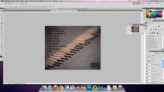
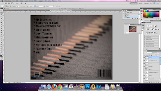
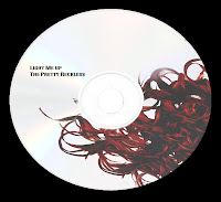
The digipak I created is very conventional and conforms to the theme of my music video. The images on the digipak relate to the title of the album and they are all visually similar in some way. This is similar to the digipak for The Best in Town by The Blackout. I ensured all of the images created a similar atmosphere by composing them in a certain way and ensuring the model's facial expressions and body language were appropriate. The tone of my digipak is quite bright which seems to be very unconventional but not that much colour was used and I needed the oranges and reds to remain bright to be symbolic of fire. I think this deeper meaning balances this subversion of conventions and makes it equally as 'dark'. The information I included on the digipak such as album title, copyright information, barcode and track list all conform to the conventions of existing products. I also used a very stereotypical layout with track listings on the back and some lyrics on the inside panes.
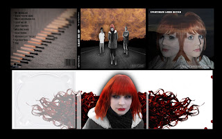
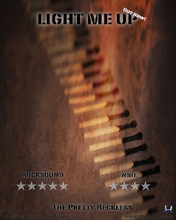
I maintained a constant style during the creation of my digipak and advert by using the same font. This shows a visual link between the products. The font I chose also suits the genre of the products and adds to the atmosphere created by the images. The advert I created uses a very similar image to the one on the back of the digipak, but I also used a blending layer to add fire to link it to my theme. I chose to use a very simplistic layout for the advert which made the information very clear. Despite it visually not looking a lot like the adverts in my research, I feel that it is very conventional in the sense it has the same effect. I also included all of the relevant information such as rating, websites and release date.
The use of fire is very symbolic of the singers anger within the video. All of my products link to this theme through the images used. The digipak also portrays the singer in a very powerful, evil way which is very relevant to the narrative of the music video when she stabs her boyfriend.
Q3 draft
What have you learned from your audience feedback?
The information provided by Youtube show that the primary audience of my video are males between the age of 13 and 24. This suggests that I have appealed to my target audience.
The majority of the feedback I received was very positive. People generally thought that the video was very well put-together, complimenting the structure. The camera work was also considered very good during the performance part where there was a lot of movement. I did however, receive some criticism for the performance part as people clearly noticed the drummer couldn't play drums. I knew this was a problem and tried my best to manipulate the editing so he was shown less but I was limited to the footage I had already taken. If I were to do this again I would definitely consider trying to find a more believable drummer.
People thought that my mise-en-scene was very appropriate for the genre. The singer received numerous compliments about her appearance which shows that the voyeuristic element I intended had been effective. I was also told that the locations worked really well, especially during the performance because it looks like some where a band might practice. This is exactly the kind of look I was intending. One person asked if the singer was holding a microphone, which she wasn't. I wasn't able to find a microphone in time for filming so we used a wire instead. If I were to film again, I would make sure to get a microphone to complete all of the props.
Some people seemed to be confused by my narrative but said after watching the video again, knowing what to expect it made the timeline more obvious.
The editing of the video was generally well received. People enkoyed the addition of the creating techniques such as the reverse burning the photo and the colour fade in. However, some people said that the editing seemed a little slow during the performance section and some more cuts could have been used to maintain a faster pace. They felt that some shots seemed to last too long with not a lot happening. Again, this is something that I was aware of because I had to extend some clips to compromise for the lack of some drummer footage.
I think I utilised Stuart Hall's Reception Theory very effectively in my planning stages which helped me encode the text. This was primarily done with the singer's image but also in more subtle ways such as the reverse sequence. People saw that and generally decoded it in the dominant way which allowed them to understand that it signified the passing of time. People also understood that the way the singer was dressed was to amplify her sexy demeanour and make her look very dominant.
Q4 draft
How did you use media technologies in the construction and research, planning and evaluations stages?
Research;
Youtube.com – This allowed me to conduct initial research into the conventions of the rock genre by looking at existing media products, I was also able to use the found videos to create a shot count which aided in the planning of my own video.
Facebook.com - I setup a page for my record company, which allowed me to gather audience research. It enabled me to post updated version of my video to be critiqued by my target audience, which in turn influenced the decision I made during the editing.
Twitter.com - Twitter allowed a platform, not only to gather audience research but also to post diary style entries of what I had been doing and what I had left to complete. This helped a lot with time management. The creation of the twitter profile also continues the theme of the record label, which I established through a Facebook page.
Blogger.com - I used blogger to display and organise all of my work. As well as it is vital to the presentation of my overall work, I also found it very useful as an archive tool as it contains lots of sources from which I can take inspiration. It shows a clear progression of my idea and project development, which aided the production of my final products. The information on my blog is also easily accessible and helped me to schedule my time efficiently to finish each task.
Apple iMac - I produced the majority of my work using an Apple iMac. The mac OS has a number of different tools, which made creating my project a lot easier. Final Cut, for example, is a programme, which is only available on mac.I also used the screen grabbing functionality to gather research and document my production process. This is done by pressing cmd, shift and 4 and dragging the curser over the area that needs to be grabbed. An image will then be saved on the desktop.
Planning;
iMovie – I used iMovie to create a storyboard animatic. This helped me to visualise the way the video will look by synchronising the drawn images on my storyboard to my chosen song. I used photoshop to crop each individual frame from my storyboards and then imported all of the images into iMovie. The programme has a timeline feature, allowing me to order all of my images by simply dragging them; creating a very basic form of the animatic. I was then able to import the music file that I intended on using in my video, which helped me to time how long each image would be shown. This enabled me to changed the time of each image by dragging the side of the clip, making the visuals sync with the audio. When it was all in sync, I was then able to export the video to a .mov format and upload
Email – I used two different email programmes in the planning stages of my project. Outlook allowed me to send a permission request to the record company behind The Pretty Reckless to ask if I could use the song Since You’re Gone for my project. Unfortunately, I didn’t receive a reply to this email.I also used Hotmail to send emails to my actors, ensuring they were available for shooting. I also sent them images and video clips of how I wanted them to look/act before they got on set. This made it a lot easier to direct.
Prezi - Creating a Prezi allowed me to document my influences and key concepts. This helped me to ensure my project followed my desired direction. Prezi allowes information to be laid out in a mind-map style. Looking at information in this way can aid the development of new ideas.
Photoshop –
Camera –
Construction;
Final Cut – I used Final Cut to create my rough cuts and finished product. It allowed me to categorise my clips into folders from different shoots. For example I had a 'narrative' and 'performance' folder. Final Cut has a very intuitive interface, containing lots of different tools, which makes video editing very easy. I was able to cut my clips and place them together on the timeline very quickly. There were also options, which allowed me to view the wavelengths of my audio track, which helped me to sync the video to the music very efficiently. I was also able to add different effects to my clips such as black and white, the fade to colour and the different speed settings.
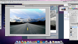
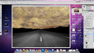
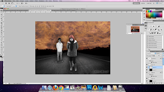
Photoshop – I used photoshop to manipulate all of my images to make them fit the theme for my Digipak and Advert. Photoshop allowed me to heavily edit the image of a landscape; creating lots of artificial shadows, setting the sky on fire and superimposing images of the band members onto it.
Camera – For the first shoot I used a different camera to the one I ended up using for my final product as I felt the quality was unsatisfactory. I used a Nikon D3100 to shoot both the video and images that I used for my final product and ancillary texts. The camera allowed me to shoot in HD with greatly improved the quality of my video and it also allowed for the zoom and depth of field to be changed quickly while filming. This helped me to conform to some of the conventions of the genre which I otherwise wouldn’t have been able to. I carried out 2 photoshoots for my Digipak and Advert, one consisted of the band and the other focused totally on fire and matches to match my theme.
Evaluation;
Final Cut
Prezi
Fraps
Wednesday, 11 January 2012
Creating Advert
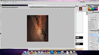
I them added a vignette effect to the image and wrote the title of the album 'Light Me Up' at the top of the page. I kept the font consistent with the Digipak. I also added a white outer-glow to the text to make it stand out from the dark background.
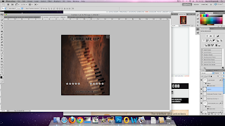
I added silver stars near the bottom of the page as a review which is a common convention of album adverts. I had to darken these stars to make them visually suitable for the advert. Under this, in the centre of the advert, I used the same font and effects as the album title to write the band's name 'The Pretty Reckless'

Thursday, 5 January 2012
Creating Digipak

