This is the Digipak for The Blackout's album The Best in Town. The two central panels in the top picture are very similar to the type of image that would be found on more common jewel case packaging. To the right is the album artwork while to the left is the track list. On the reverse side of the track list is where the disk tray is placed. In this Digipak there is only room for a single CD but it is not uncommon for them to contain multiple disks.
The images used are all a very specific cartoon art style which is very dark and creepy. Images such as the town have a very clear link to the album title. This helps to set a theme for rest of the images and begins to almost create a strange narrative.
The images used are all a very specific cartoon art style which is very dark and creepy. Images such as the town have a very clear link to the album title. This helps to set a theme for rest of the images and begins to almost create a strange narrative.
The five panels I have not yet mentioned are what makes up this 'narrative'. This has been done by illustrating lyrics from songs on the album. I think this is a very clever way to provide a taste of the album without playing any music.
The artwork is very gloomy, using lots of blacks as well as darker tones of earthy colours such as browns and greens. White is also used to create a high contrast and create very atmospheric imagery. The theme even continues onto the disk itself which has no writing. This therefore suggests the style is individual enough for people to immediately recognise. The majority of text that is used on the digipak is in a handwritten font, adding to the creepy theme of the artwork. Some of the words are even faded to suggest they were written a long time ago. This is very relevant to the context of the lyrics such as "This is where the it all began, and this is where the story ends". The images and text work very well together because they are both highly stylised to develop the sinister atmosphere.
The band is represented in quite a disturbing way with the references to hell and the image of the hand emerging from the ground. It's evident they were attempting to create a very ominous sensation surrounding the album and I think they have achieved it very successfully. I also think it represents the tone of their lyrics very accurately, although you would probably expect their genre to be heavier. The style also suggests a lot about the institutional context of the music because we can definitely assume that it isn't designed for mainstream audiences.
The band is represented in quite a disturbing way with the references to hell and the image of the hand emerging from the ground. It's evident they were attempting to create a very ominous sensation surrounding the album and I think they have achieved it very successfully. I also think it represents the tone of their lyrics very accurately, although you would probably expect their genre to be heavier. The style also suggests a lot about the institutional context of the music because we can definitely assume that it isn't designed for mainstream audiences.
The way this digipak has been designed makes it very relate-able to the band; the main signifier being the use of lyrics on certain panels. The design also makes it very appealing to the target audience which I would categorize as specialist.

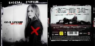
This digipak is for Avril Lavigne's album Under my Skin. The artwork is very stylised to portray Avril in a way which will reflect her star persona. The album is mainly black and white, reflecting the tone of the album which is very depressing. Some areas are also highlighted in red which may relate to anger and pain, again reflecting the tone of the album and concept behind the lyrics. The red cross on her arm may also suggests that she feels targeted. This same red cross is shown on the disk, linking the two together.

Only two images are used on the digipak, both showing the the singer. This suggests the album is a reflection of her emotions and she relates to it. It is also used as a marketing technique as her star image may grab people's attention and sell the album. The same font is used for all of the text, except the small print at the back. The font is very stylised to conform to the dark nature of the album, this is very common in the singer's work. The album title, Under My Skin is written in red. Red is a very emotionally intense colour, amplifying the implications of the title.
The layout is very simple. This may be done to make the singer appear alone, an idea which is often inferred by her lyrics. This idea also links the images with the text to magnify their meaning. The dark style is something that is very common within the genre, especially when the album was released. The digipak has been created to give the impression that the music is quite underground when in fact it was known in mainstream media. The audience however, still seems to be fairly niche due to the gloomy feeling of the album.


No comments:
Post a Comment